
HyperJar
•
2020
HyperJar is for people who care about their financial well being and the Kids card is the culmination of the financial education for kids coming to reality in practical terms. At one of my junctures at HyperJar, I lead the creation of the look and feel for a new physical and web/mobile product that both sit inside the financial hemisphere and under the HyperJar brand.
Lead Product Designer
System Design
User Interface Design
Card Design
Interaction Design
Marketing Creative
UX & Flow and Engagment
Jens WIlkholm, Head of Product
Jeff Taylor, Head of Engineering
Chris Francis, Chief Stratergy Officer
Jake Cason, Head of Marketing
Kochava :), Analytics
To bring a free Kids card to the market that will sit alongside the full access adult HyperJar card; in a market that is growing in the niche of kids financial tools. The ultimate goal is to build and launch the card and gain 10k+ waiting lists of orders.
One of the highest traffic pages on the current HyperJar.com site is the arrival of the Kids card - with information on the unique features and the proposition of parental control. The page is in need of a fleshing out for launch.
Our database of user data aggregated on Kochava, data gathered through questionnaires and a 1k+ Facebook group awaiting the launch of this financial tool have given sufficient insight to the user base and demographic who will be using this app and card combo.
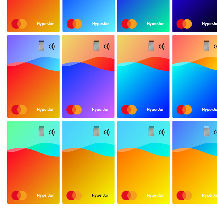
Initial ideation and creative for the Kids Card
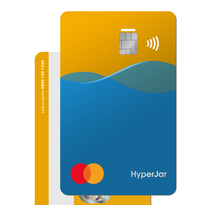
Final look at the Kids Card that went into production
My process of creating a well designed UI, with UX fundamentals at its core:
User needs were clear and concise for this interface, as we had spent time on research, while making sure we had enough data on the user make-up to leave all the guesswork out.
When it came to placing the UI elements on the page, I worked closely with Jake (Head of marketing) to make sure we were able to funnel the user to the information they required most in their hierarchy of needs on the page and a CTA was never too far from the viewport.
Many of the interactive elements on the page, such as signing up for the card and the app download with email verification were designed with the processes of SendGrid and firebase in mind and the authentication messages and status updates for the user to feel confident and informed in their handing over of personal information.
As we had physical card design finalized we were able to curate a bespoke UI to match, giving the user the feeling of ownership and anticipation of the card they would be receiving one the launch had been completed.
We wanted to minimize the use of colors outside the design guide we had made, opting for a simple use of illustrations to present the unique features of the card and app.
Less is more is always at the top of the list and the use of coins to give fluidity of design elements between the app and website were a choice made after the final design had been finalized to bring more of a child friendly feel to the UI.
We aimed to create a design system for web and mobile centered around the physical Kids Card and produce a website that would allow users to join the waiting list for the Kids Card launch. While creating a child friendly feel for the user to potentially synonymize the light hearted design to an easier less transactional feeling of a traditional bank.
Easy and distinguishable illustrations to make the feature set of the app and card easily digestible, contrary to the traditional banking found in the industry. Heavy use of color in these scenes set the tone for the reusable color palette and illustrations around the creative for this Kids Card launch.
As a merchant heavy app we had various large companies offering incentives to the users and to showcase to the users the credibility of the platform. As a financial platform it can and we found it was harder to convince users to allow us to see and manage their finances. (The grey used complies with the WCAG color contrast guidelines).

To quickly familiarize the user with the services provided by HyperJar, I chose to use the phone mockup of the app with the Card to show which financial tools we provided when the user signed up to the waiting list.

After ideating for weeks on the final design for the Kids Card, we were finally able to come to a decision on the look and feel for the overall design guide for the Kids Cards launch. We A/B tested with multiple designs and color schemes for the card itself, which then played a major role in the macro design system used in the website and mobile designs for the site.
The overarching goal for the site was to achieve 10,000 sign-ups to the waiting list for the KIds Card, this was achieved and even more. The total number of sign-ups to the website were in the region of 12,000 with the average CTR to the waiting-list form 46.3% from the total of 26k page views.
The job card redesign improved our job seekers’ overall experience by making jobs easier to consume—first on Suggested Jobs and later across our entire product suite. Personally, this project gave me some valuable insights:
By systemizing the job card design, I was able to create capabilities for our product management team that would outweigh the initial benefits of simply improving the visual design and hierarchy of the card.
It’s important to be able to adapt to new constraints and moving targets. Building products is rarely cut and dry. As teams work alongside each other, things can change and that’s okay. Changing my angle from what to include to how to include steered the job card to where it is today.
Communicating well and involving the right stakeholders early on can pay huge dividends. In the process of redesigning the job card, I saw an opportunity to improve the way we utilize design systems. Through good communication, I was able to get buy-in and kick off what would be the start of a more mature design system process.


